

All designs by Beck DawsonProject overview
UX Designer •
UX Writer •
UX Researcher •
Art Director •
UX Designer • UX Writer • UX Researcher • Art Director •
THE PROBLEM
Creative freelancer burnout is on the rise - partially due to the large amount of financial admin required. PAYNT want to be the best solution to this problem.
THE GOAL
Our client wants to support creatives and empower them to stay freelance, by making invoice management easy and painless.
THE PARAMETERS
Budget: £40K. Timeline: 3 months. Target: Creative freelancers. Scope: Design a responsive website and app to enable effective invoice management.
Final prototypes

After completing PAYNT’s final app prototype, I reiterated the UX design process to produce a responsive website. This timeline benefitted from my prior research and the existence of a style guide.
Given sparse imagery was a necessity to optimise this product’s functionality, I wanted to celebrate the brand’s iconography instead. To do this, I presented the key icons that users will require on the website login page as a low-opacity background pattern. By including less formal icons like the ‘piggy bank’, the design goal was to make the app feel less intimidating to financially unconfident users. Equally, this design was kept monochrome to avoid becoming ‘whacky’, potentially losing user trust.
Style guide
The colour orange is widely associated with creativity, warmth, and energy. This is also true in branding — consider some of the world’s most creative companies that use orange as their main colour, e.g. Harley Davidson, Etsy, and SoundCloud.
Meanwhile, studies have found that many of us associate the colour blue with finance and banking apps — a trend corroborated by my competitor research.
One finding from my user research was that many of our target audience (creative freelancers) feel intimidated and / or demotivated by financial management software, leading to lots of people putting off essential tasks.
This is why I chose to use orange as the main brand colour: to go against trends, speak directly to creatives, and increase engagement. However, as blue is commonly seen as the most trustworthy colour and is complementary to orange, I included it in the product style guide as a tertiary colour.

Website design

Responsive design

User research
PERSONAS
Using this research, I created three core user personas: the time-poor, the scattered, and the intimidated. These helped to identify and aim to solve key problems in our users’ journeys.
COMPETITOR RESEARCH
By analysing direct and indirect competitors such as Notion, Miro, Monzo, Wave, Xero, Freshbooks — I found limits in their branding, accessibility, and their capacity for invoicing customisation.
USER RESEARCH
User research for this project involved primary and secondary research, including desk research, a competitor audit, 1:1 interviews with creative freelancers, and a usability study.
User journey

⬇


⬇


⬇

⬇
⬇

⬇

Design strategy
Educate •
Automate •
Condense •
Engage •
Educate • Automate • Condense • Engage •
HYPOTHESIS STATEMENTS
If Katie has a way to automate client emails, then she can spend less time chasing clients about invoices.
If Pippa can see all of her payments and invoice details in one place, then she will be able to remember who owes her what.
If Omar can get live support and have AI do the heavy maths lifting, he will be able to face regularly using a finance app.
PRODUCT GOAL STATEMENT
”Our invoicing app will let users automate and integrate the end-to-end invoicing process and access relevant industry guidance. By making freelance finances more manageable, we will empower creatives to continue doing what they love — independently, but not alone.”
“We will measure effectiveness by analysing the proportion of users who start paying for a subscription after their 30-day free trial ends.”
PROBLEM STATEMENTS
Katie is a freelance copywriter who needs to automate invoice reminder emails to reduce admin time and improve work-life balance.
Pippa is a multi-industry freelancer with ADHD who needs to keep track of her various income streams.
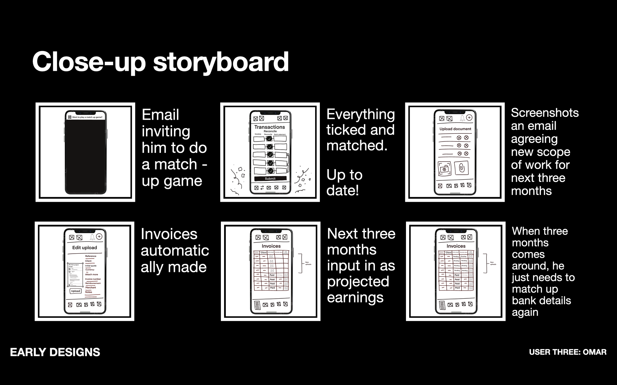
Omar is a freelance session musician who needs his invoice management to be less intimidating because he gets anxious dealing with finances.
Wireframes and low fidelity prototypes


Usability study


Accesibility considerations
FONT SIZE
The font size was increased app-wide to make information easier to read and select. While the focus of this alteration was those with visual impairments, this type of change aids everyone.
UNIVERSAL SYMBOLS
After the usability study, where respondents had struggled to navigate quickly from page to page, I added standard symbols next to each heading — enabling them to see where they are within the app at a glance.
BUTTON SIZE
The usability study found that the toggle buttons were too small for people with restricted fine motor skills so this was fixed by making each button larger with surrounding negative space.