Project overview
UX Designer •
UX Writer •
UX Researcher •
Art Director •
UX Designer • UX Writer • UX Researcher • Art Director •
THE PROBLEM
The Letterboxd app is highly regarded by movie geeks from around the world, however, many users find the information architecture confusing, disorganised, and at times repetitive.
THE GOAL
To re-design Letterboxd’s information architecture in a way that is clearer and more pleasurable to navigate, keeping the users’ interests front and centre, while retaining the brand’s established style.
THE PARAMETERS
Target: Anyone who watches movies. Budget: Pro bono. Timeframe: two weeks. Scope: Re-design the existing app; enable users to write reviews, like and search films, create film lists and interact with friends.
Final prototypes


User research
USER RESEARCH
The main user research that helped to define where to focus this re-design was user reviews in The App Store and Google Play store. I also conducted 1:1 interviews and usability studies
PERSONAS
Using this research, I created core user personas based on four core reasons users are coming to the app: Film inspiration, social connection, critical contribution, and cataloguing film lists.
COMPETITOR RESEARCH
By analysing direct and indirect competitors such as IMDb, Rotten Tomatoes, Vue Cinema, Odeon — I found their ability to build a film lover communities lacking, but their information architecture broadly more intuitive.


Design strategy

3. Part of the reason why the same information was repeated in different places on the app was a lack of clear categories to group information. This is key to help users intuitively move seamlessly through a digital experience without having to think about each action.
By studying users and creating personas, I was able to define four key functions users want and expect from Letterboxd: film inspiration, a film-centred social community, to contribute to critical discussion on film, and to be able to catalogue films with lists.
Accordingly, each of these functions now has its own dedicated button in the main navigation bar. For example, the new ‘Popular’ button allows users to browse popular films, articles, reviews and lists via a toggle at the top of the screen. Similarly, the ‘friends’ button includes all friend activity including what films are most popular amongst them, their reviews, ratings, lists and more — all in one place. I also relocated notifications to the top panel, using a universally recognised bell symbol, as this is fewer clicks than clicking on “activity” and “inbound”.
After my initial research, I restructured the app’s information architecture to better suit the needs of its users. Some core changes include:
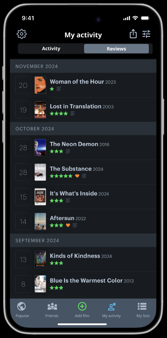
1. In the original design, the “Dairy”, “Reviews” and “Activity” (under “you’), and “Recent Activity” pages all duplicate the same information. To tackle this, I dedicated a button on the bottom navigation panel exclusively to the user’s own activity. Here — and only here — they can see their film stats, reviews, ratings and more.
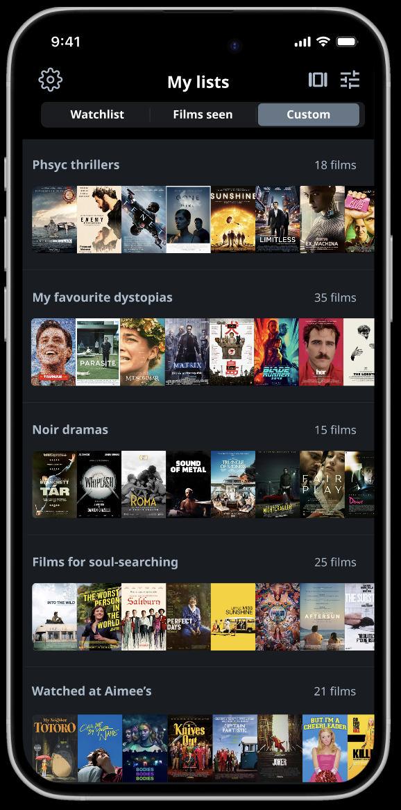
2. Research showed many viewers were frustrated by not being able to easily access the list of films they have already watched — a core reason many use the app. To see this list, users must navigate to their “profile” then scroll down, below the fold and below an advertisement to then click another button labelled “Films”. This function proved confusing in user testing. One participant pointed out “Is this my seen ‘films’? The entire app is ‘films’.”
In response to this challenge, I prioritised ‘lists’ as its own section in the app’s navigation bar to provide a clear and easily accessible place for users to quickly see their watchlist, ‘seen list’, and custom lists they have made.

Key takeaways
ACCESSIBILITY
Big buttons for those with reduced motor skills.
High colour contrast where text is involved for those with visual impairments.
Familiar, internationally recognised symbols to better serve people who speak different languages.
Adding text alongside symbols for those who are less tech literate and are potentially unfamiliar with the common meanings for app symbols e.g. some elderly people.
KEY CHANGES
Adding a personalised film recommendation feature
Placing users’ film lists in a clear location, above the fold
Removing unnecessary repetition by re-organising information into clearly defined categories
Creating more interaction points for users to be social with their friends e.g. enabling them to ‘heart’ any of their friends updates.
Reorganising film specs to give users the information they want most, first.
GOING FORWARDS
Letterboxd is undoubtably a brilliant app which provides a lot of joy and connection for people all over the world.
This project reaffirmed my belief that an app does not need to be unsuccessful or faulty in order to hugely benefit from a UX overhaul.
There is always more we can learn about how users are interacting with a virtual product and how we can make their lives a little easier, more pleasurable, and less confusing. While this was a pro bono, independent project, I would love to work with Letterboxd’s team to implement and further develop these ideas.