
Project overview
UX Designer •
UI Designer •
UX Researcher •
Art Director •
UX Designer • UI Designer • UX Researcher • Art Director •
THE PROBLEM
Food waste apps often fail to cater properly to plant-based communities because “surprise bags” often contain animal products. Given the old adage: “beggars can’t be choosers”, many veggies opt out of using these apps which otherwise strongly reflect their eco values.
THE GOAL
Make an app that enables plant-based users to form local communities through saving plant-based products from going to waste. Last Plants will unite and empower users through collective, tangible action. Rather than just *stopping* waste, we will *start* eco movements.
THE PARAMETERS
Target: vegetarians, vegans, and the environmentally conscious. Timeline: one month. Budget: Pro bono. Scope: Design an app to help build eco communities and distribute plant-based food at a discounted rate to prevent food waste.
Final prototypes


User research
TARGET AUDIENCE PERSONAS
Our veggie and vegan audience can be distilled into four categories, based on their main reason for avoiding animal products: Budget vegans, Eco vegans, Health Vegans, and Ethical vegans.
COMPETITOR AUDIT
By analysing competitors such as Olio, Karma, Nosh, and Too Good To Go — I found limits in their emphasis on community-building and adherence to their anti-consumerist, waste prevention values.
RESEARCH METHODOLOGY
User research for this project involved primary and secondary research, including desk research, a competitor audit, 1:1 interviews with veggies and vegans, and a usability study.
User personas


Design strategy
Unite •
Invite •
Delight •
Unite • Invite • Delight •
HYPOTHESIS STATEMENTS
If Mateo can get cheap veggie meals, then he stay vegetarian at no greater cost — proving ‘veggie’ doesn’t have to mean pricey.
If Amina can exclusively buy from 100% vegan establishments, she can live in alignment with her values and be an eco role model.
If Liam can guarantee his meals are allergy-safe, he can meet his nutritional goals as a vegan — confident in his health and safety.
If Mei can have support getting ethically-sourced food to her home, she can help to protect animals with each meal.
PRODUCT GOAL STATEMENT
”Our plant-based food waste prevention app will let users live in accordance with their eco values and build support networks. By building communities, providing greater dietary options, and reducing barriers to living a plant-based lifestyle, we will empower and unite people to make the right choices for themselves and others.”
KEY PROGRESS INDICATORS
“We will measure effectiveness by analysing the number of app downloads, friend invites, and the average number of friends each user adds.”
PROBLEM STATEMENTS
Mateo is a vegetarian freelance visual artist who needs to buy affordable meals to reduce his outgoings.
Amina is a vegan chemistry student who needs to buy exclusively from vegan establishments to align with her environmental values and influence others to do the same.
Liam is a Personal Trainer who needs his vegan meals to be high-protein, low FODMAP due to his numerous food allergies.
Mei is a Retired Business Director and animal lover with mobility issues who needs help getting cruelty-free food delivered to her home.
Brand values development


Logo & adaptive family design
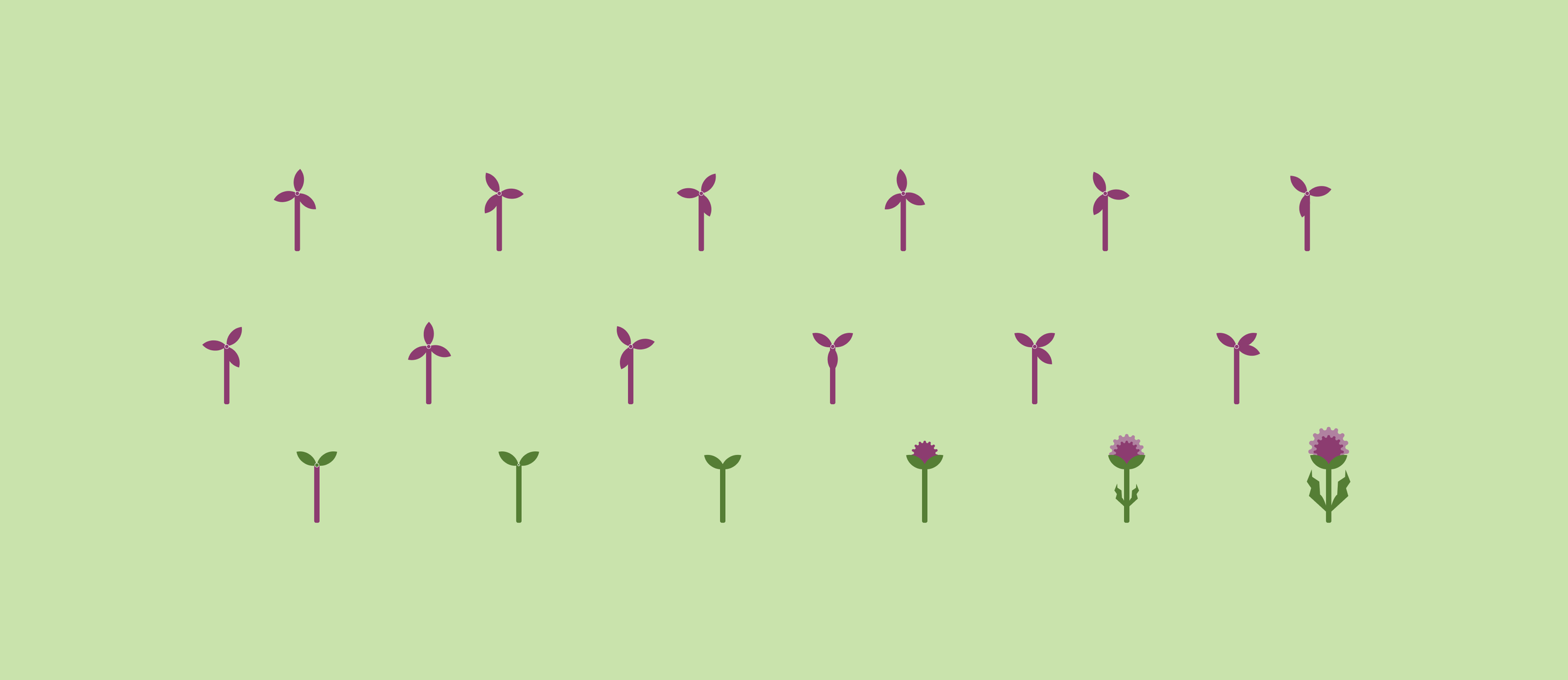
User research found that many veggie and vegan curious potential users held some negative preconceptions about environmentalists as being aggressive. This is why it was important the thistle design remained approachable and soft, despite depicting a prickly flower.
For future marketing purposes, the logo has been strategically designed to seamlessly transition into various other brand visuals in short animations. These will all be relevant to environmental topics.


I kept the design simple to ensure scalability and versatility, maintaining clarity across digital platforms, from app icons to social media. Using the brands’ primary and secondary colours, the logo passes all colour blindness texts, visible from every trichromatic view.
Potential animations: the top leaves and stem turn into a wind turbine. The flower changes into the brand’s tertiary orange palette to look like the sun. And the lower leaves turn into lightning bolts.
Style guide & interactive components
For consistency across the entire app, all symbols have the same line weight to size ratio. These components were scaled up and down depending on the context, and a great variety of symbols were required due to area-specific pages which contained lists. For example, the ‘Earnings and money saved’ page required different varieties of money and sales symbols to distinguish categories.

The badges were designed to reward restaurants for their most notable offerings, as deemed by customers. This gamifies the experience for both sides, while also guiding and incentivising restaurants on how and where they could up their game. These components needed to be interactive, so that users can select and change the colour of three badges of their choosing.

Checkout confirmation animation
Accesibility considerations
PHYSICAL DISABILITY AND TIME BARRIERS
One of the app’s USPs is the ability to do good deeds for neighbours near you, who may have physical disabilities or other barriers to using the app, (e.g. being time poor). Therefore, ensuring travel distances were clearly displayed was crucial — this makes it easier and more appealing for able-bodied users to recognise and help people close by.
DIETARY RESTRICTIONS
The concept of “health food” varies greatly depending on people’s specific dietary needs. After the usability study, where some respondents had struggled to find foods they deemed as being good for them, further dietary filter options were added, such as “Low FODMAP”, “Soy-Free”, “Low-Carb”, “Gluten Free”, and more.
SOCIO-ECONOMIC DISPARITY
The usability study found that users on strict budgets were disillusioned by discovering different prices within each restaurant profile page. To fix this, on the “discover” and “browse” pages, a drop down menu was added enabling users to compare specific bag options and their corresponding prices from there, saving time and money.